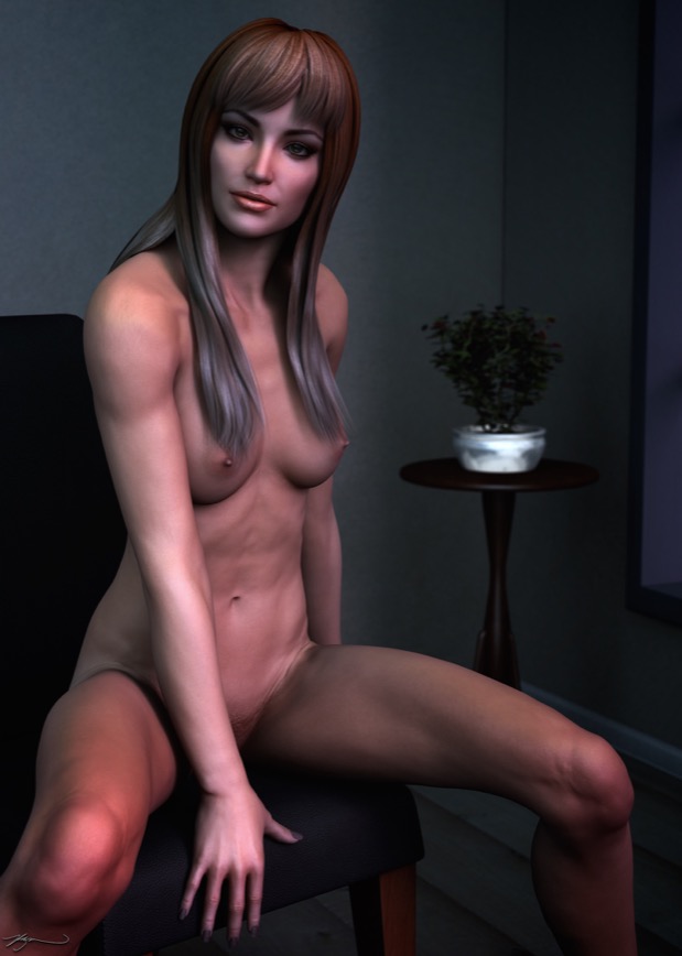
Chair Pose
Oct 11, 2014 Filed in:
Victoria 6I really liked the way that the
Stargazer render came out. I wanted to do another simple nude render. Something with a low prop-count. Maybe just Victoria and a chair.

That’s a good start, but maybe I will put in a simple background. Maybe just a wall.

I added a couple of walls and a floor and then started dropping in some lights. I couldn’t resist, I just had to add a little table with a plant.

I then gave it a test render.

It needed some depth-of-field, and a lot more work with the lights. I also changed the camera angle a bit. I actually did a few separate renders and layered them in Pixelmator. I played with the hair color too, which did something interesting when layered with different opacities.
All-in-all, not bad. I like how playing with different layer settings such as Hard Light, Screen, and Overlay can really do some wonders to the lights and darks of the skin. I think it adds a little more realism.

This was an interesting experiment. I usually try my best to get all the lighting perfect on the final render, but layering different renders together with totally different light settings can make for some interesting results.


