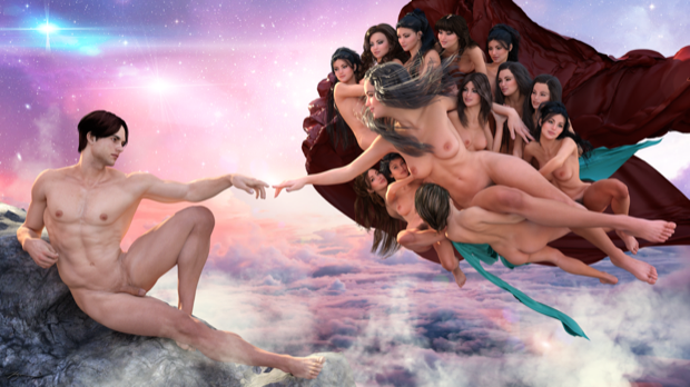
We’ve all seen Michelangelo’s famous “The Creation of Adam” fresco that is part of the Sistine Chapel's ceiling. It’s such a famous and iconic painting, that I wanted to do my own rendition.

I first started out with Michael 6. I tried to get the pose just right. It’s not perfect as they don’t have the same frame, but I think it’s pretty close.

I then dropped in Victoria 6, gave her some morphs, some hair, and again, tried to pose her just right.

Not bad.

It would have been nice to do a one-to-one copy, but I don’t have any age morphs, nor do I have any robes that would look period-correct. I decided to make all the other characters in the scene female and keep them nude. I’m not saying that God should be a woman; I’m not even suggesting that she is God. I’m not even looking at this as a religious piece. This is just art. Nothing more, nothing less.
With that, I started dropping in more Victoria’s and posed them around the main character.

The other 12 Victorias in the scene need to be a little smaller than the main character. I scaled them down to 70%. I not only did this so that I could fit all 13 characters in the scene, but it reinforces the fact that the main character is indeed the main character and that she is being lifted up by the other 12 Victorias. If I made all 13 Victorias the same size, it would be hard to tell who the primary focus is on.
Once I was happy with the placement, I added some hair, and morphed them all slightly so that they’d all look a little different.

I then gave it a test render. Not bad. This is actually starting to look like something.

I then added a rock underneath Michael. It was a little tricky trying to find the perfect angle, but with a little rotating and scaling, I think it came out pretty good. It looks like he’s laying on it.

I then added some sheets behind the Victorias. I added some morphs and deformers to wrinkle them up.

This’ll pretty much be it for the scene. The rest will be done in post. All that remained was to work on some lighting.

I added a light rig and started to play around with it.

I did about 10 different renders at 2560 x 1440 before I was happy with the results. I had the quality and sampling cranked up pretty high, so the render would have gone on for a day or two before it reached the 97% conversion ratio I had it set to. I stopped the render after 19 hours figuring that it was as good as it was going to get. As long as the shadows aren’t grainy, I’m happy.

I then took the render into Pixelmator to add the background and some additional effects. This is where the artistic license comes in, as the original painting doesn’t have much going on in the background.
I started with a beautiful sunset image high above the clouds. This makes it look like Michael is on top of a mountain.

I then added in some stars and nebulae.

I then added in some clouds behind and in front of the characters to give the image a little depth.

I cleaned up the sheets to remove some of the “pointy bits” and finally, added some start bursts and lens flare. With a touch of sci-fi and fantasy, I think my modern-day rendition came out fantastic!


