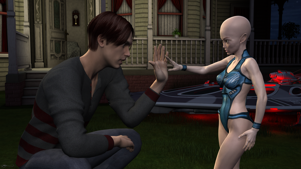
I’m continuing my foray into Sci-Fi with this M6 and V6 duo. I wanted to do something where I could shrink down Victoria and display her as a cute little alien. Something simple and not too over-the-top.
I wanted Victoria to meet a human for the first time, so I started to work on a scene where she makes contact with Michael.

I wanted to her to appear curious, but shy and somewhat childlike. I started to drop in some background elements. Perhaps it’s Michael’s house. Perhaps she landed her ship at night and Michael heard her in the backyard. Maybe he was alerted by lights from her ship.

I continued to play around with the pose until I had the look I was going for. Michael sits there in a non-defensive stance as if to appear approachable. He has his hand out as if to suggest it’s OK to touch. Imagine your demeanor if trying to coax a stray cat or dog towards you. Think of reaching out with your hand as if to say, “It’s OK”.

To make Victoria a little more alien, I made her head just a little bigger. To make her a little cuter, I made her ears a little pointier.

I wanted this meeting to happen late at night when the backyard is nice and dark. The only lights would be that from the porch, the moon, and the ship. I started to drop in some spotlights and gave it a test render.
That looks pretty cool. She hesitates a little, but she’s just about to touch his hand.

I added some lights to the ship, as well as the porch, and placed some props inside of the house so that you can see them through the doorway.

OK, now that’s starting to look like something!

I wasn’t too happy with the blue lights on the ship, so I changed them to red. I also scattered some tuffs of grass over the yard.

As far as the house, I added some shades to the windows, a front door, another plant on the porch, and a clock and picture frame in the doorway.

It’s perfect. I really like the way this one came out.

The portrait version has an aspect ratio of 8x10. It doesn’t really lend itself to being cropped for the desktop. I went ahead and changed the aspect ratio to 16:9 and repositioned the camera for a second render.
This one looks much better on the desktop.


