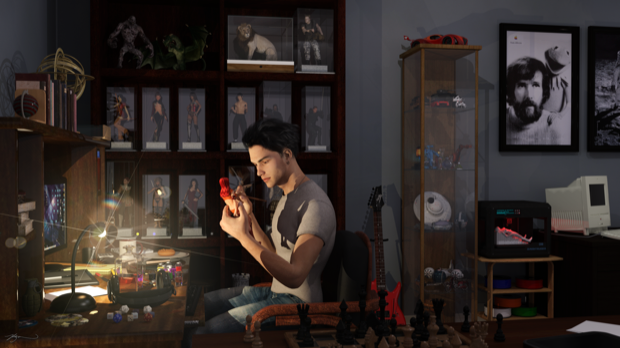
A few years ago, I came up with a cool idea for a render. I wanted to create a scene that showed Michael painting some Victoria figurines. He’d be sitting at a desk, with some sort of display cabinet behind him that would be full of all his creations. That idea has been on the back burner for a while now, so it was time to play around with some ideas and see if I could bring it to life.
I picked up this office desk set a while ago. It was a DAZ freebie at some point. I dropped it into the scene.

I swapped out the plant for a chair, and then loaded the desk up with a bunch of miscellaneous props.

I then dropped in Michael and Victoria.

I shrunk Victoria down to about 12 inches and placed her in Michael’s hand. I gave him a paint brush and also added another desk in the foreground with a chess set.

I then got to work on the display cabinet. I dropped in a bookcase and scaled it vertically so that the shelves were far apart enough to fit a 12 inch model. I then added a display case and Victoria 6.

I dressed her up and shrunk her down to 12 inches and then resized the display case to fit her.

I then repeated that process until the bookcase was full of Victoria and Michael figurines.

To fill the top shelves (that you’re probably not even going to see), I dropped in and resized a bunch of cool props.

I then grabbed another display case and filled it with more props. Cars, ships, bikes, potion bottles, UFOs. The works. This scene is a good chance to use a lot of the DAZ freebies that I otherwise would probably never have a use for. I mean, how often and how many times are you going to need a UFO in your render?

Next up was a printer stand with a 3D printer. I shrunk down a Genesis model and placed her on top of some support material. I then changed the whole model’s surface material to white plastic.

I didn’t have any rolls of filament, so I decided to try my hand at creating my own 3D model. I jumped into SketchUp and created something that looked like a roll of filament.

I then exported it as an .STL, then dragged it into Netfabb and exported it as an .OBJ. I was then able to import it into DAZ Studio and add some materials.

Finally, I added a guitar. That’s a decent amount of props for the background.

But it needed more…..
This render is shaping up to look like my room as a teenager. So it wouldn’t be complete without a Classic Mac. I still have a room full of them, so it’s only fitting that any scene that remotely resembles my mancave (or my room as a teenager) would need to have a Classic Mac.
Rather than try and make one myself, I searched SketchUp’s 3D warehouse and found no shortage of Apple products. This Color Classic looks amazing. A job well done by the creator. It’s a perfect recreation.

Just like the 3D printer filament, I exported it and converted it to an .OBJ file and dropped it into DAZ Studio. I then gave it a slightly yellowed vintage finish. I then added a tiny plane primitive to the front and textured it with an Apple logo.

Wow, that’s really starting to look like something. This is pretty much what my room looked like as a teenager. I’ve always had wall-to-wall computers, guitars, and all manner of geeky stuff.

I then dropped in some walls and a floor. I was going to go nuts with the posters on the walls, but I decided to just drop in some Apple Think Different posters above the computer desk and leave it at that.

Time for a test render. Of course, the lighting is all wrong, but wow, this is really turning out to be pretty cool!

Well, he’s painting a model but there’s no paint in sight. There should be a bunch of little hobby paints on the desk. Unfortunately, I didn’t have any props that would fit the bill. Again, I jumped into SketchUp and put something together. I made it into three different pieces so that I could add different shaders to the different sections.

As a test, I imported it into DAZ Studio. I textured the top of the jars with glass shaders, the bottoms with some colored plastic shaders, and the caps with metal. Not bad.

I then dropped those into the scene and placed them in front of Michael on the desk. You can hardly make them out, but I know they’re there. I also started to play around with the lighting and fine tuned the placement of some of the props.

I added some lights coming from the desk lamp as well as from the monitor. I even swapped out the wallpaper on the monitor for a screenshot of my own desktop.

It was at that point that I realized I made Michael left handed. It was for no particular reason. I think it was just so that Victoria’s back wouldn’t be to the camera. Not that this is a self portrait or anything, but anyone that knows me is naturally going to assume it is. So I might as well make him right handed. The pose was also completely unrealistic. There’s no way you’d have your arms extended that far out in front of you if you were painting some intricate details on a figurine.
I swapped hands, pulled his arms in, and tucked in the elbows. Much better.

It just needed a little twinkle of light on the desk lamp, a slight vignette, and it was good to go.


