This is
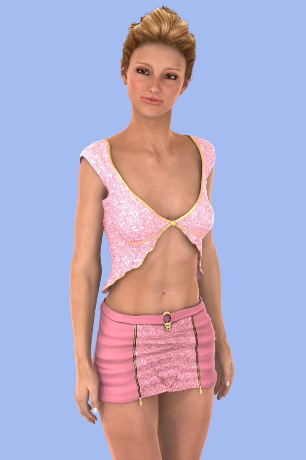
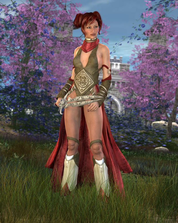
Sabina, a new character just released. She has a nice slender build like
Giselle, but maintains a more mature look.

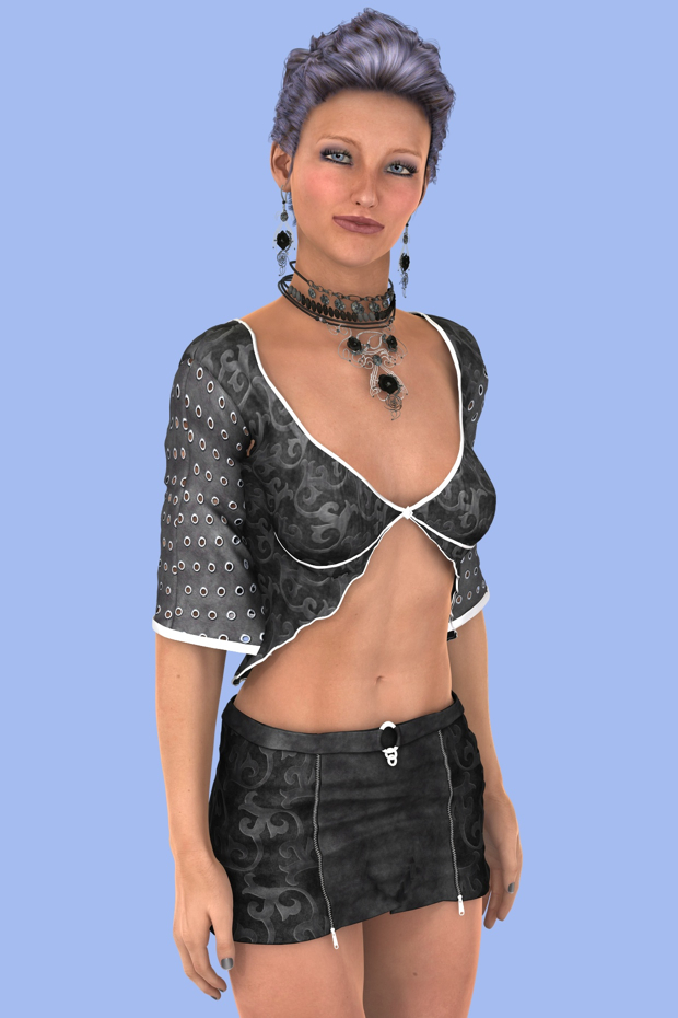
Mixing up the makeup can make her look even older.

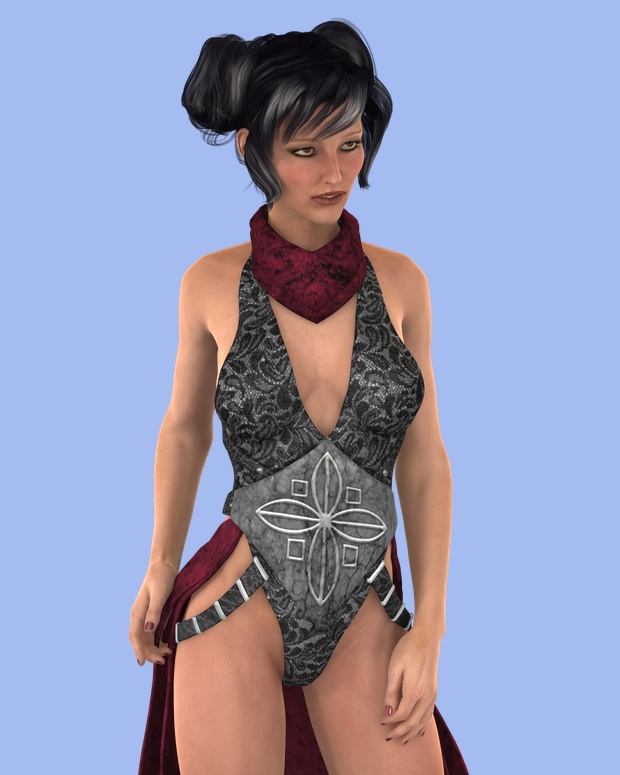
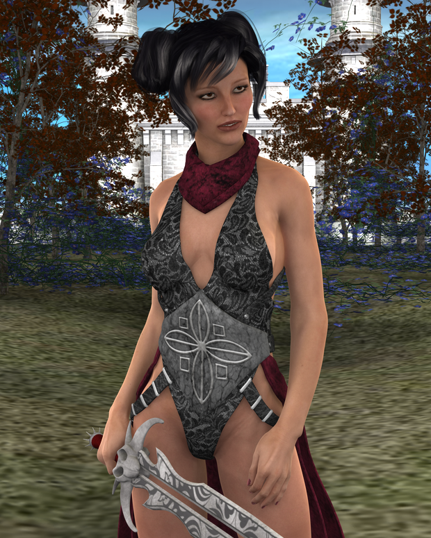
I wanted to see her she fared as a fantasy character, so I dressed her up in the
Dayala outfit and gave it a
texture.

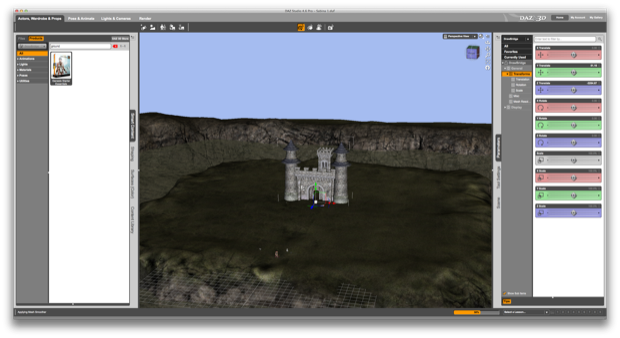
I wanted to make this one a portrait. I wanted a very deep depth of field, so I placed the
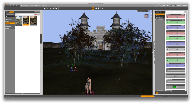
Fantasy Castle Grounds into the scene and placed a
castle off in the distance.

I then started dropping in some trees from the
Iyeyasu's Tomb set and some vines from
The Folly.

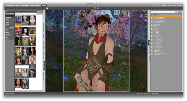
I then rendered it out to see how she looked.

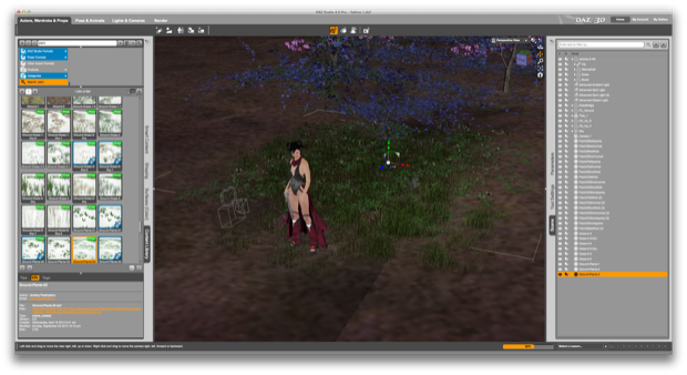
It’s looking good, but it needs more stuff in the background. I started dropping in some random grass, plants, and rocks. I also changed the colors on the leaves to pink.

I dropped in some lights, adjusted the camera’s depth-of-field, and gave it another render. Lookin’ good. However, I don’t like the color theme on the Dayala outfit. It doesn’t really match the color-scheme I’m going for.

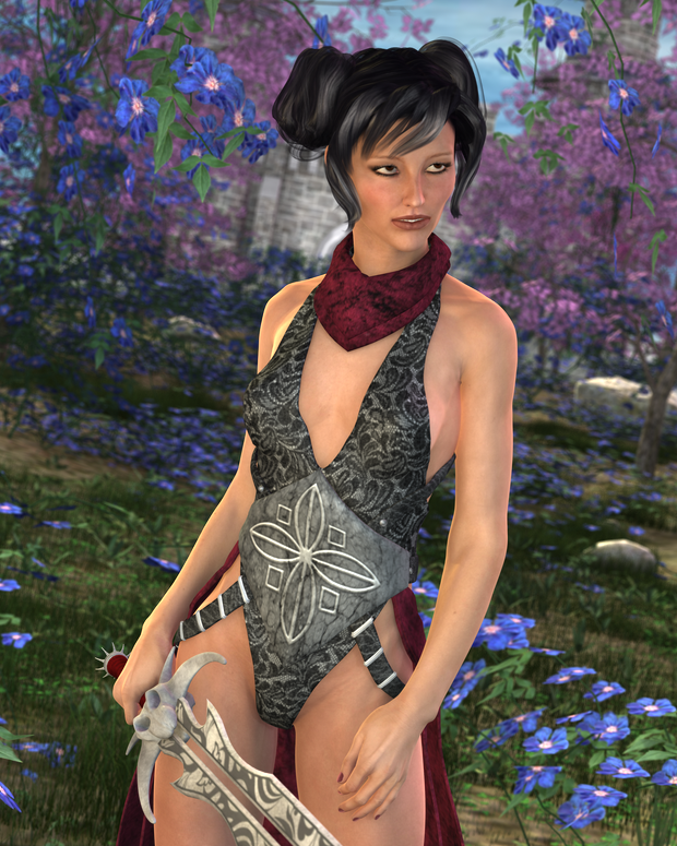
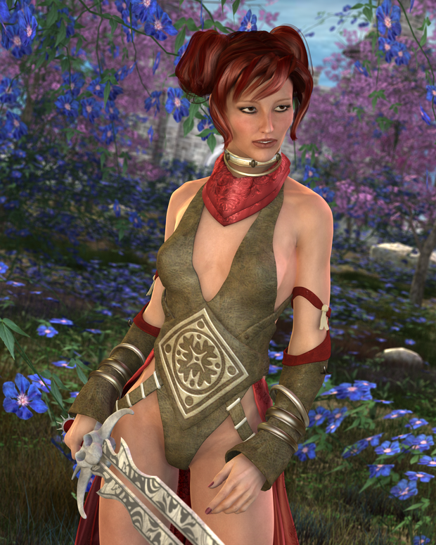
I changed it to another texture, changed her hair color, and rendered it out again.

Much better. I want this scene to be nice and bright and colorful.

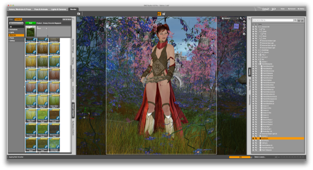
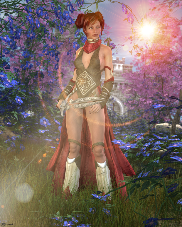
The background came out so nice, I’m afraid a lot of it gets lost in a close-up portrait. I decided to pull the camera back a bit to capture more of the background.

Now that looks cool!

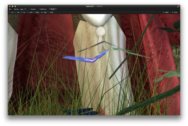
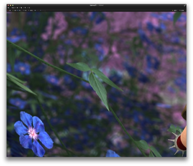
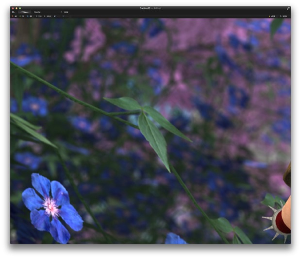
There are a few random flowers that seem to just float in the scene. They don’t seem to be connected to a stem. I decided to render out another image without them, so that I could fix them in post.

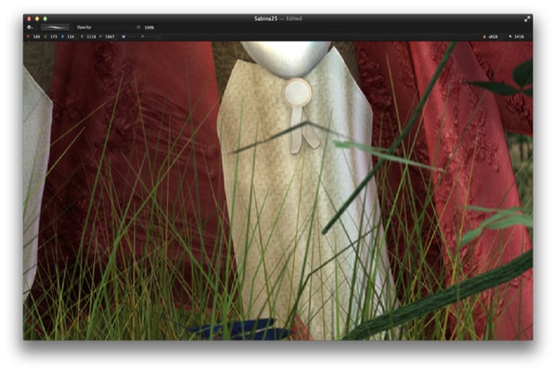
I then layered the two images in Pixelmator and erased the flowers that were either floating, in the way, or out of place.

Much better.

Some of them I didn’t want to erase, but rather draw in some stems to make them look more realistic.

Much better.

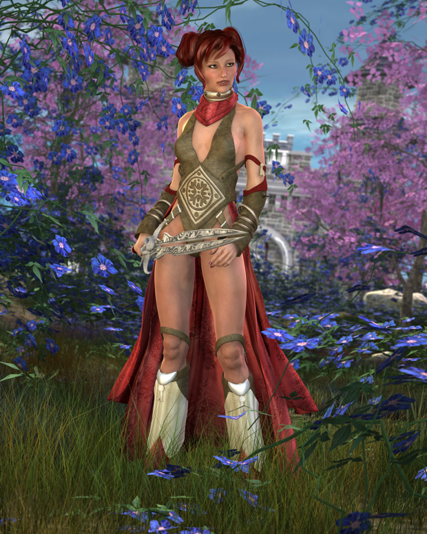
There we go. That looks much better. It’s one of those things that you’d probably never notice, but it’s the attention to detail that makes all the difference.

I then added some lens flares and bokeh.

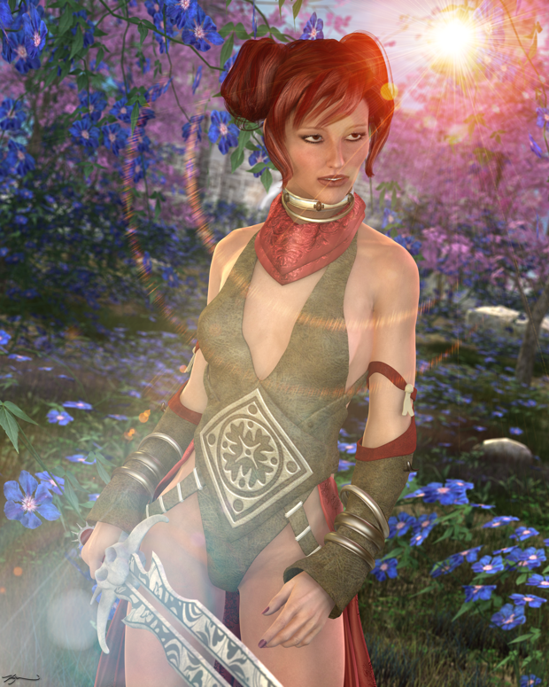
It came out so nice, I decided to go back to the close-up portrait and add the same effects just to see how it looked.

Not bad, but I think I like the other one better.


