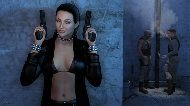
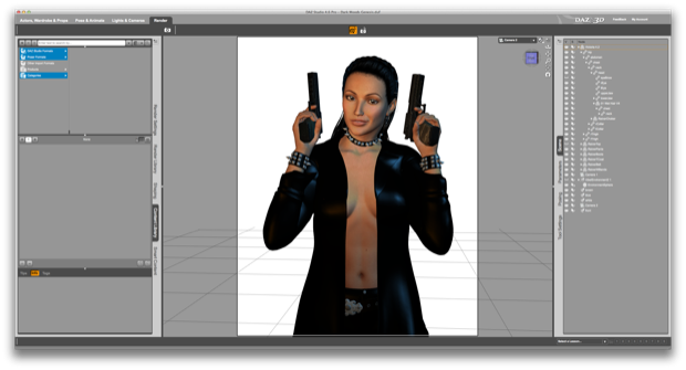
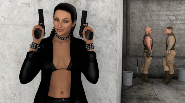
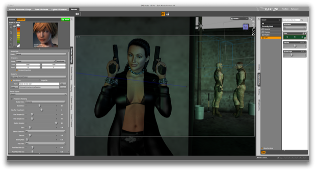
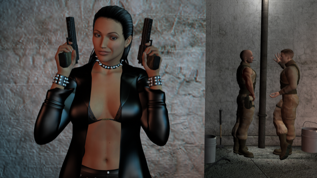
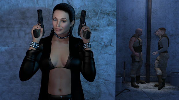
When I start out a scene, I usually have been thinking about it for days. I usually have the whole thing laid out in my head before I even start. For this one, I had nothing in mind and wasn’t even planning on it. I just wanted to dress Victoria up in a trench coat and give her some guns. Having her naked underneath just made it sexy.
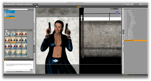
I loaded in Victoria 4 and dressed her up in the
Raiver outfit and gave her some
Stalker Girl Guns for Genesis.

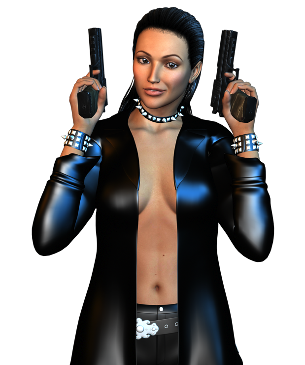
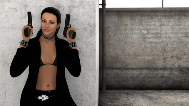
A quick render. Very sexy.

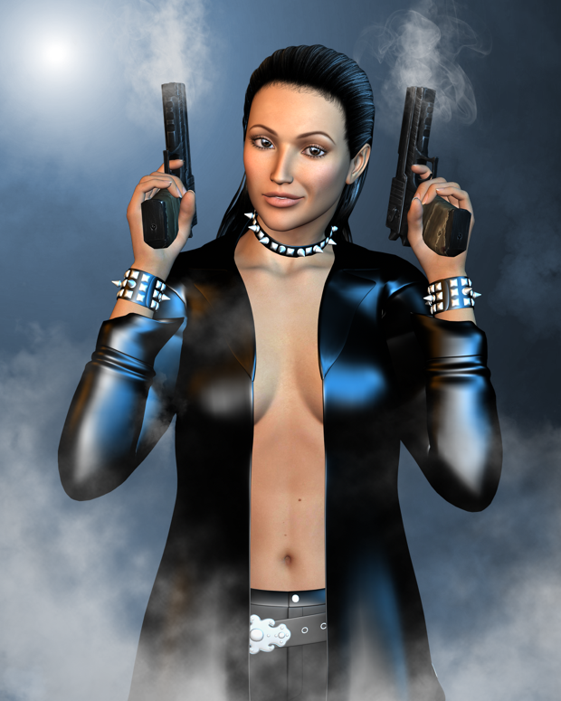
I took it into Pixelmator and played around with some fog and smoke brushes just to get a few ideas. This looked cool, but it needed to be more than just a portrait. I wanted it to be a complete scene.

I picked up Jack Tomalin’s
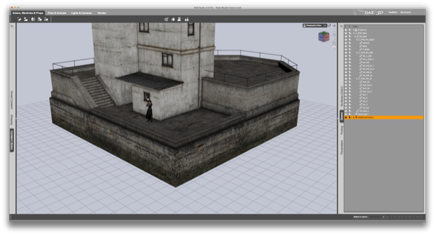
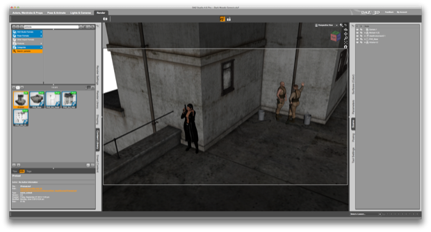
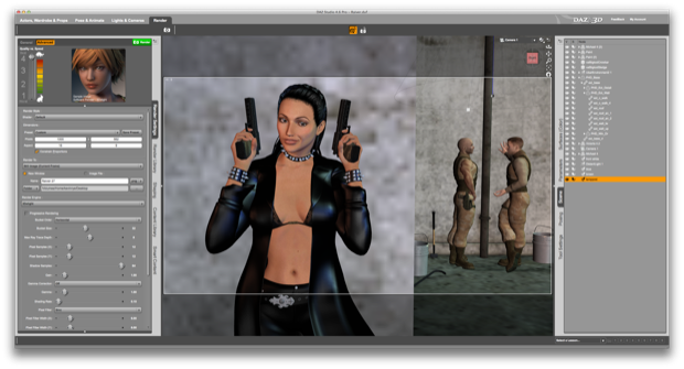
Parkside Head. It’s a huge set. I placed Victoria at the far wall, right at the corner.

I wanted it to look like she’s giving you a little smirk right before she takes out some bad guys. Sort of breaking the 4th wall. OK, so I gave her a bra. Sure, naked under the trench coat is mad sexy, but it’s impractical for the scene. I mean, would you run around half-naked shooting bad guys?

A quick render. This might just work. And yeh, the bra is still sexy.

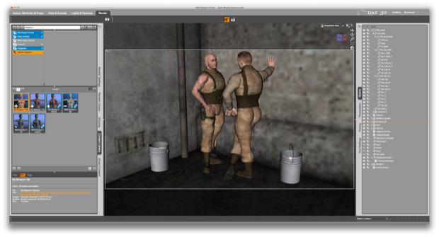
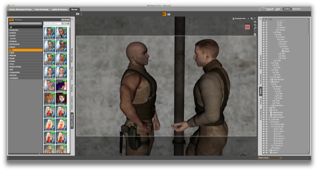
The scene is going to need some bad guys. I dropped in a few Michael 4s, dressed them up, and added a few props.

Another quick render. That’s the angle I’m going for. Those guys are about to catch a bad one.

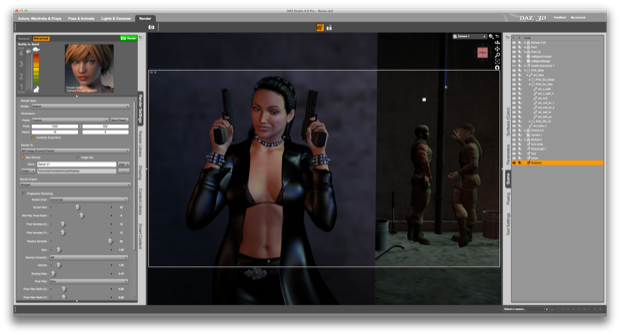
I thought of maybe giving it the Fight Club/Matrix green-light treatment, so I dropped in some lights and gave them a greenish tint.

Nah, not really feeling it. I like the moonlit look, so it needs to have more of a bluish tint. I also wanted to have somewhat of a spot light or something on the bad guys. It would be nice to have the pole between the two so I could fake it as a lamp post. I also wasn’t happy with the texture on the wall behind Victoria. The wall has a great texture, but I think it’s meant to be seen from more of a distance. It’s not detailed enough to have someone’s back right up against it.

I played around with some other textures, but it wasn’t coming out right. I figured it would just be easier to move everyone to the other side of the building.

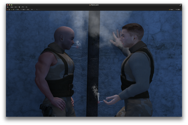
I figured while I was at it, I’d throw a couple of cigarettes on the bad guys. Maybe they’re just out back having a smoke. Maybe they’re guarding an entrance. Who knows? At least this way it looks like they’re talking to each other and otherwise not paying attention to what’s going on around them.

I then moved the camera and lights back into position.

Not bad. Now it looks like they’re definitely standing under a lamp post.

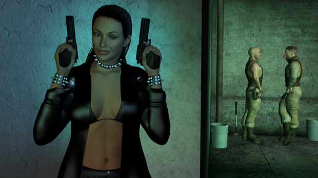
I played around with the lighting a little more to give it a nice blue tint.

That’s more like it. Now it’s dark and cold, and late at night.

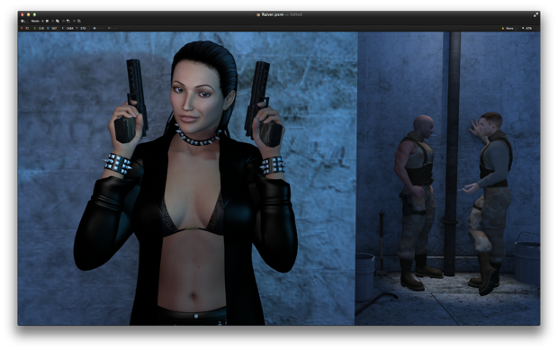
I then took the image into Pixelmator for some post work.

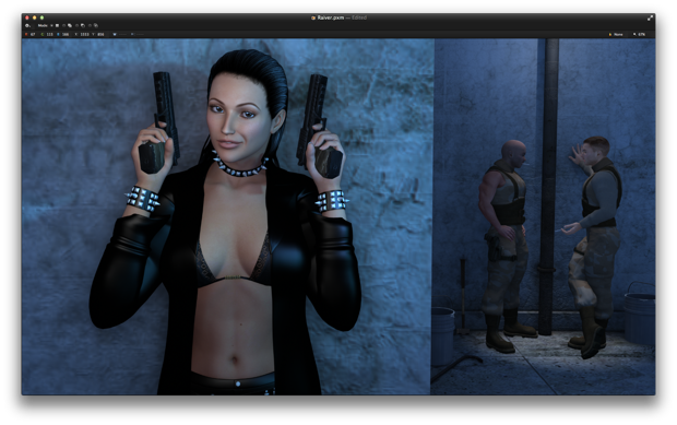
I wasn’t completely happy with the shadows behind Victoria. The original image is 2560x1440 and takes about an hour to render. Rather than play around with the lights some more and wait another hour, I just duplicated her, added a little drop shadow, and played with the opacity. Not a lot; just enough to pull her away from the wall an inch or two.

I then added some smoke for the cigarettes.

And there she is. The Assassin.
