I picked up a cool
Yoga pose set for Genesis. There’s a lot of nice looking Yoga poses in it. I figured it would make for a nice tranquil scene.
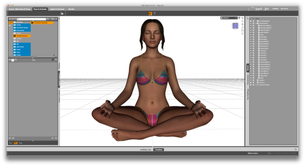
I started with Genesis 2 and added the
Ianthe texture. I then gave her a classic Yoga pose.

I wanted to make use of the free
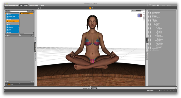
bridges that DAZ gave away a few weeks back. I set Genesis on top of the simple arched bridge.

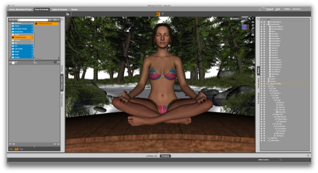
I then added the Forest and some water to the background.

I wanted this scene to have a nice depth of field. That way, I can add some sunrise lighting to the background and add some bokeh effects over the water.

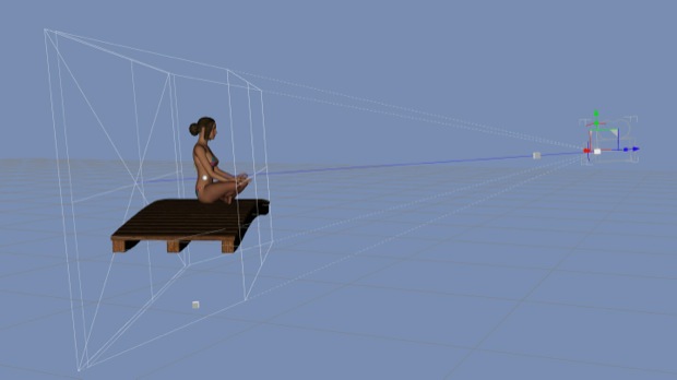
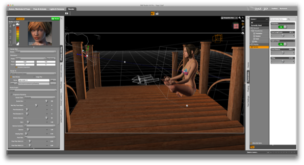
I adjusted the Depth of Field, Focal Length, Focal Distance, and Focal Stop settings on the camera in order to blur out the background.

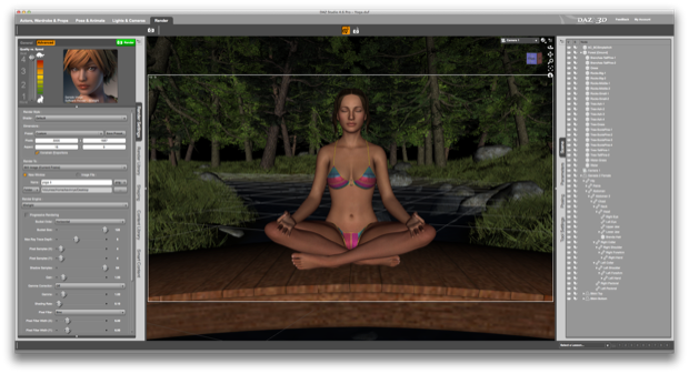
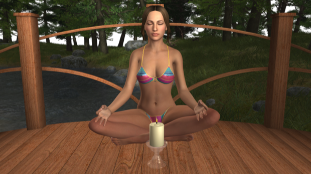
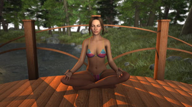
With everything in position, I ran a test render.

Not bad. There’s enough space between the trees that I should be able to add a convincing-looking sunrise. It might be a little too blurry, but we’ll see.

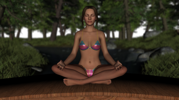
I played around with the lighting a little more and reset the DOF setting in order to speed up render times.

It looks cool, but I really want to zoom in on Genesis a little more. I want her to fill the screen. Also, having a blurry background doesn’t make any sense when the subject is 20 feet in front of you. However, bringing her forward makes the bridge look weird. Without seeing the water under the bridge, you lose the sense thats she’s even on a bridge over a stream. It just looks like some weird arched thing she’s on. You have to assume it’s a bridge.

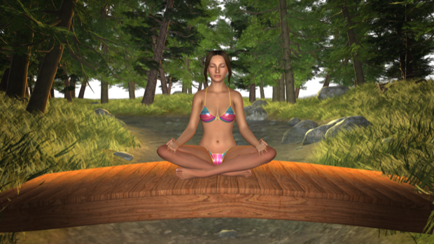
Solution? Change the bridge.
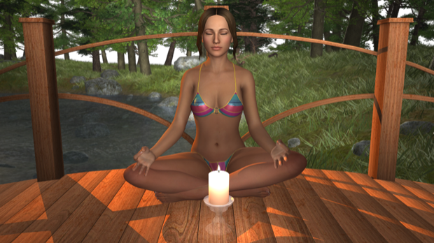
Now, hopefully you can tell she’s on a bridge over the water. I even added a candle.

I added the lights back in and gave it another render.

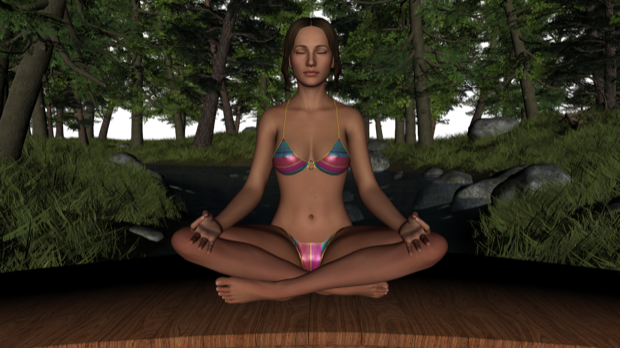
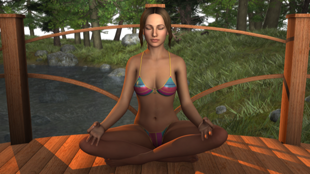
I’m not happy with the candle. I think siting over a babbling brook at sunrise is enough to “find your center”. I don’t think she’d need a candle. I added the depth of field back in, ditched the candle, and re-rendered. It’s hard to see the blur in the background since the original image was shrunk down from 2560x1440 to 620x348.

Needless to say, I wasn’t happy with the depth of field, or the lack thereof. I tweaked the camera once more.

The only way to get some good depth was to pull back a little bit with the camera.

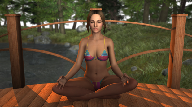
Again, I wanted Genesis to take up most of the frame, so I then cropped the image. That’s better!

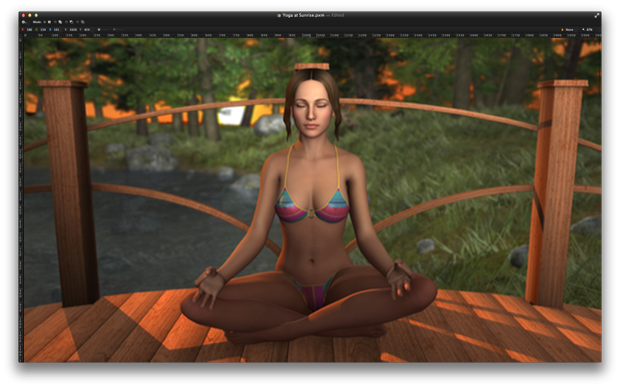
I then took the image into Pixelmator and started to play around in the background until I had a convincing sunrise that matched the lighting.

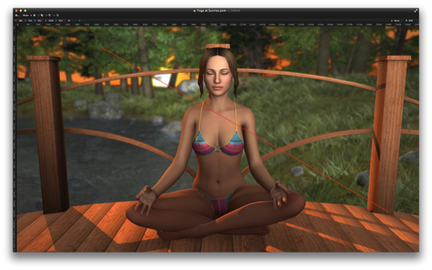
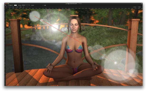
For the lens flair, I started by drawing a red line where I wanted the flare to extend.

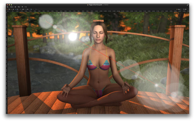
I then started to experiment and play around with circles, sun bursts, blurs, and opacity. I kept adding along the line until I had what looked like a pretty convincing flare.

I then sprinkled in some little tiny circles throughout the background of various opacities for a little bokeh effect.

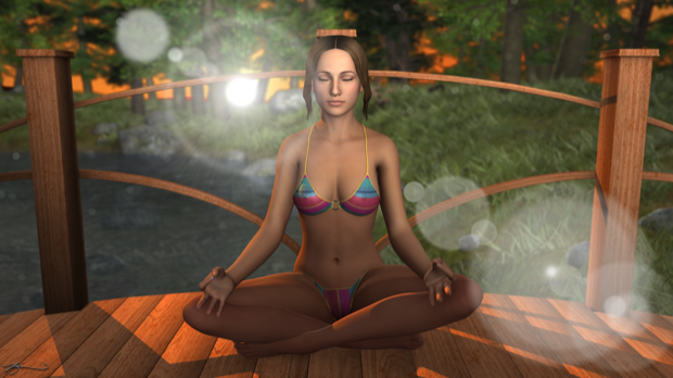
The finished piece:

I’m really happy with the way this turned out. I just might have to add a little depth of field to all my renders.


