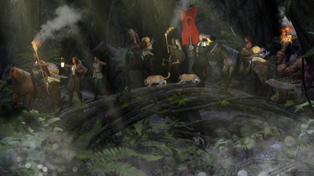
It's been a long time since I've done a full-on render chock full of goodies. The last one was probably
Pirates! I love doing these types of renders that have just a ton of stuff to look at. Let's get to it.
I've been dying to use
The Enchanted Forest in a render. For a while there, I forgot I even had it.

It looks awesome.

I hid most of the scene so that I could see what was going on. I dropped in several characters, along with a few horses.

I then worked on positioning everyone along the bridge.

I then went to town on dressing them up and adding a ton of props. This is a test render with all the lights at their defaults. In the end, I want this forest scene to be dimly lit so that I can give them some torches.

I played with the lighting and added some torches and point lights.

It's pretty dark, but it's not finished yet. You get the idea.

I like to put little easter eggs in my images; just to see if anyone notices them. For this render, I put some skeletons under the bridge. Pirates? Smugglers? Who knows, but it looks like they met with an unfortunate end.

I then moved them into position under the bridge.

I also dropped in an old wagon and painted the textures with some browns and greens to make it look moldy and dirty. I then scattered about some crates and barrels.

That's starting to look like something, but I think the skeleton hanging from the underside of the bridge is a little much.

I snuck him into the back so he's a little less obvious.

I added more props, more lights, a flag pole, and some leopard cubs.

I aded the
Look at My Hair extension to the cubs to give their hair some added realism.

That's looking pretty good.

I then took the final render into Pixelmator to add some effects. I started out by adding some mud and dirt to the horses and everyone's boots.

I added some smoke and fire.

For the Behemoth at the end of the line, I wanted the smoke to look like it was going behind the trees.

I rendered out another version without the background trees so that I could drop the new layer down on top of the smoke.

Same with the flag pole. I rendered two versions. One with and one without the flag.

That way I could erase portions of the flag to make it look tattered and worn.

I then dropped in some fog, bokeh, and fireflies.

Finally, some light rays.

Wow, this one came out really cool. Seeing it shrunk down to 620 x 348 doesn't do it justice. The original image is 2560 x 1440 and looks awesome on my desktop.


