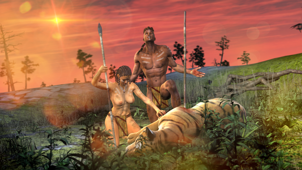
This one just sort of came to me out of nowhere. I was playing with Zev0’s
Skin Builder and came up with a pretty dark skin texture. I thought Victoria looked great with a really dark skin texture. She looked pretty good in the
Pirates! render. I decided to drop Michael 5 in and apply the
Benjamin texture for a nice duo.

I also gave them the loincloth that came with the
Creature Creator for G2M. I though a cool hunting scene with this duo would look pretty cool. It’ll also give me a chance to use DAZ’s
Big Cat 2. (Which I have to admit I haven’t done a lot with.)

I then added a Tiger and posed Victoria and Michael with some spears.

I then got to work on adding in some trees and vegetation.

I then dropped in a sky and some lights, and gave it a test render.

Not bad.

I tweaked the lights, camera angle, and the depth of field.

Now we’re getting somewhere.

Victoria’s skin still looks a little yellow. I tried to darken it up a bit, but no matter what I do, I just can’t seem to match the subsurface settings on Michael. She’s either too dark, or too light, but too uniform in color without a lot of subsurface scattering. I don’t mind if they’re different shades. Actually that would be more realistic since no two people have the same skin color, but as of now she looks kind of fake next to him. Actually, she looks like she’s covered in clay.
I decided to ditch Skin Builder and use a real texture. However, I don’t have any dark skin textures for Victoria. I do for
Stephanie 5. With that, I swapped out Victoria 6 for Stephanie 5. I saved my pose and then applied the
Keira texture and pose to Stephanie.

Much better. Now she has some lights and darks.

The background and foreground needed more “stuff”. I added a whole bunch of plants and grass to the scene.

I also gave the duo some necklaces. I moved some of the larger plants right to the foreground so that they’d be out of focus in the final render.

Now that looks like what I was going for.

They just needed a little more sunlight on their backs.

I wasn’t totally happy with the necklace on Michael. It’s actually a M4 asset, so it just wouldn’t fit no matter how I tweaked it. I can’t get it close enough to his skin without the medallion in the middle disappearing under the skin. Needless to say, in the render it looks like it’s floating an inch off his chest. I decided to just ditch it. Besides, Stephanie has one. It would probably look weird if they both had on the same necklace.
Now it just needs some post-work. Using my trusty
Bamboo tablet, I started to add in some tribal paint. You so need a pen and tablet for this kind of work. You just can’t do it with a mouse.

Same with Stephanie.

After adding the paint, I started to throw in some mud and dirt.

Same with Stephanie.

It was then time to add just a little blood. Not too much. I’m not looking for gore or shock value, just enough to add some realism.

I then added some lens flares, some bokeh, and a little vignette at the bottom. Very nice. I really like the way that this came out. You should see it at 1600x2000. It looks awesome.

Of course, I can’t post boobies in the DAZ 3D Gallery, so I’ll have to make another one that’s PG rated. I used the tank top from the
Creature Creator for Gen 2 Females. It’s the only thing I have that doesn’t look totally out of place in this scene. However, the material isn’t a good match at all.

With a little cloning and stamping, I re-retextured it with elements from the loincloth and applied it to Stephanie.

Much better. I also had to edit my dirt and paint layers so that they look like they are under her top.

At least this way I can post it in the DAZ 3D Gallery without having to worry about it getting kicked out.

But I just couldn’t leave well enough alone. I liked this render so much that a desktop version was in order. I can’t exactly put an 8x10 render on the desktop. I readjusted my camera’s aspect ratio to 16:9 and rendered it out.

I then added my post work layers and tweaked them so they’d fit.

Awesome.


